In Part 1 of Creating Better Vacation Photos by using the Rules of Composition, we covered Having a Subject, Filling the Frame, and the Rule of Thirds. If you’ve practiced these in your photography you are probably noticing that you are taking better images already. In this part, we’ll talk about:
The Horizon – Where to Place It
Leading Lines
Leaving Some Space
Leading Lines
Leaving Some Space
If you missed Part 1, you’ll find it further down in this blog. So let’s get started!
- The Horizon – Where To Place It
The general Rule of Composition here is to not put your horizon in the center of the image. Put it on or near either the 1/3 or 2/3 composition line. Here we have two views of the same image. The first one is a general snapshot of a beach in southern California. It’s okay, but it’s not something that tells a story or that you’d print and frame. Note in particular that the horizon in the top image is in the middle of the photo and the subjects are centered.


The image on the bottom is a crop of the top and I’ve used the Rules of Composition to fix it. The surfers are placed according to the Rule of Thirds, and doing this has brought the horizon closer to the 2/3 line. It’s a much more pleasing photograph and easier for the viewer to get a sense of and feel a part of what is happening on the beach. In general, to emphasize the upper part of the image, the horizon should be at the 2/3 line, and by placing it at the 1/3 line, you emphasize the bottom part of the image.
- Leading Lines
Leading lines are meant to brings the viewers attention to specific areas of the image. They can go horizontally, vertically, or diagonally through the image. The image below demonstrates the rule of Leading Lines. The grasses around the edge of the image lead the viewers’ attention directly to the center and the subject of the image.

The image below is an example of leading lines that converge. These lines bring the viewers attention directly to the person walking across the bridge. Remember that leading lines can be anything as long as they lead the viewer in to the image and not out of it.

- Leave Some Space
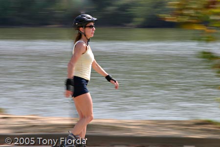
This Rule of Composition generally states that you should leave space for the subject to move in to or through the frame of the image. If the subject is a person running from left to right, the right side should have space for the subject to run in to. If not it looks as though the subject is running out of the photo.
In portraits, space makes the subject look comfortable. Here are two versions of images leaving space.

In the image above, because I made tight crop, I’ve placed a small space to the right side of the image keeping the subject from looking like she’s bumping up against the edge.
In the image below, the additional space on the right allows the subject to move in to the photo. The other photographic technique used for this photo, although not a Rule of Composition, is called panning. I used a slow shutter speed to capture some motion in her arms and legs at the same time I was following her with the camera in order to blur the background, giving the effect of her moving quickly in a still photo.

- Summary
I know it sounds like a lot to think about when taking a photo…and it is…and as you practice them, they’ll become second nature. But if you remember to think about these Rules of Composition each time you look through the viewfinder and prior to pressing that shutter release, your pictures will go from just snapshots to great vacation images in no time.
Be sure to leave a comment if you have questions or other comments. Thanks for stopping by.
